Boon Donation app is a single platform for Donor, Donee and Organization. Any needy can raise a concern through Boon for education, Food or any specific pupose.
The aim of this project was to make a single App for Donor Donee and Organization for all purpose needs and help youngs to olders in United States.
INDUSTRY
Donation & Charity
ROLE AND DURATION
Empathise, Define, Ideate, Prototyping, UI Design
2022
CLIENT
Project Scope
The project requirements was to build a single build application for the people who need support for education, food, shelter, automobile, hospital or any kind of cooperation. Besides utility, the project includes organizations also who can help and avail their helping hands to any category nearby their location in Untited States.
Main Concept
Boon application for Donee and yen
Sub Concept
For whom who wants to help
Competitive Analysis
To proceed with the project, I did some competitive analysis survey with some of the competitors which already in this stratum. So based upon my exploration i found two corival: gofundme and Fundly
gofundme
GoFundMe is an American for-profit crowdfunding platform that allows people to raise money for events ranging from life events such as celebrations and graduations to challenging circumstances like accidents and illnesses.
Pain points on gofundme
gofundme charges are very high while withdraw of money and during reatime its sometimes a hassle in withdrawing money to bank account.
Complex posting limitations for communities.
Fundly
Fundly is a crowdfunding site for online fundraising. It allows non-profits, charities, politics, clubs, schools, teams, churches, and other causes to raise money online from friends, family, colleagues, donors, and other supporters
Pain points on Fundly
No Application for android and iOS
Slow server response rate
Many fake Donee profiles and no security
Qualitative Interviews
To better understand the users, I interviewed with peoples from all walks of life. The interview is to make sure people could think out loud and share more details on using Donation platform. During the interview, I found out that most are family people, especially mens who use digital donation platform for medical and education puepose.
‘’Last year i tried donation app for my mother surgery and everything worked well but while withdrawing money to my bank account, it’s creating server error message’’.
-Family Guy
‘’There is no platform where i can post for my further education need. i tried many other ways but nothing worked well. If someone wants to study further, Can we have one good solution’’.
-Bachelor
‘’Few applications do exit in andriod but its way to complex to understand and post. I really want somethng more simple and ease to use’’.
-Family Guy
Ideation
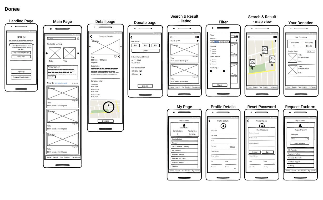
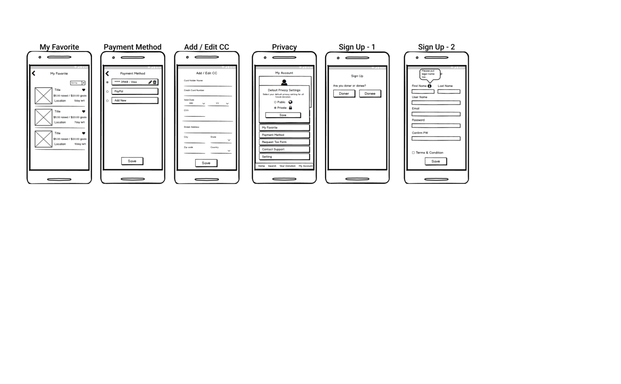
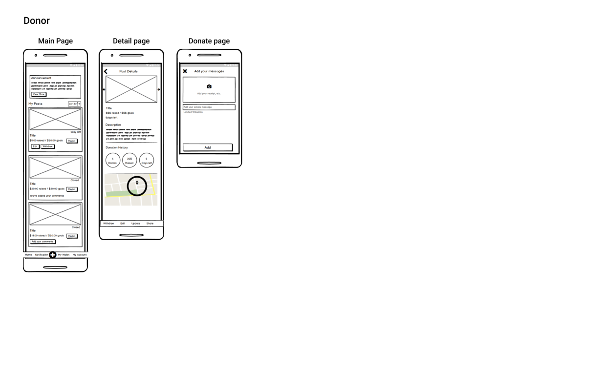
We brainstromed and decided that we would need to have two components as part of our overall solution. We decided to integrate Donor and Donee in single mobile app. We sketched some screen contruction and transition, and amke some embodiment by the user flow. We made some splash screen screen, screen transition and minimal concept animations.
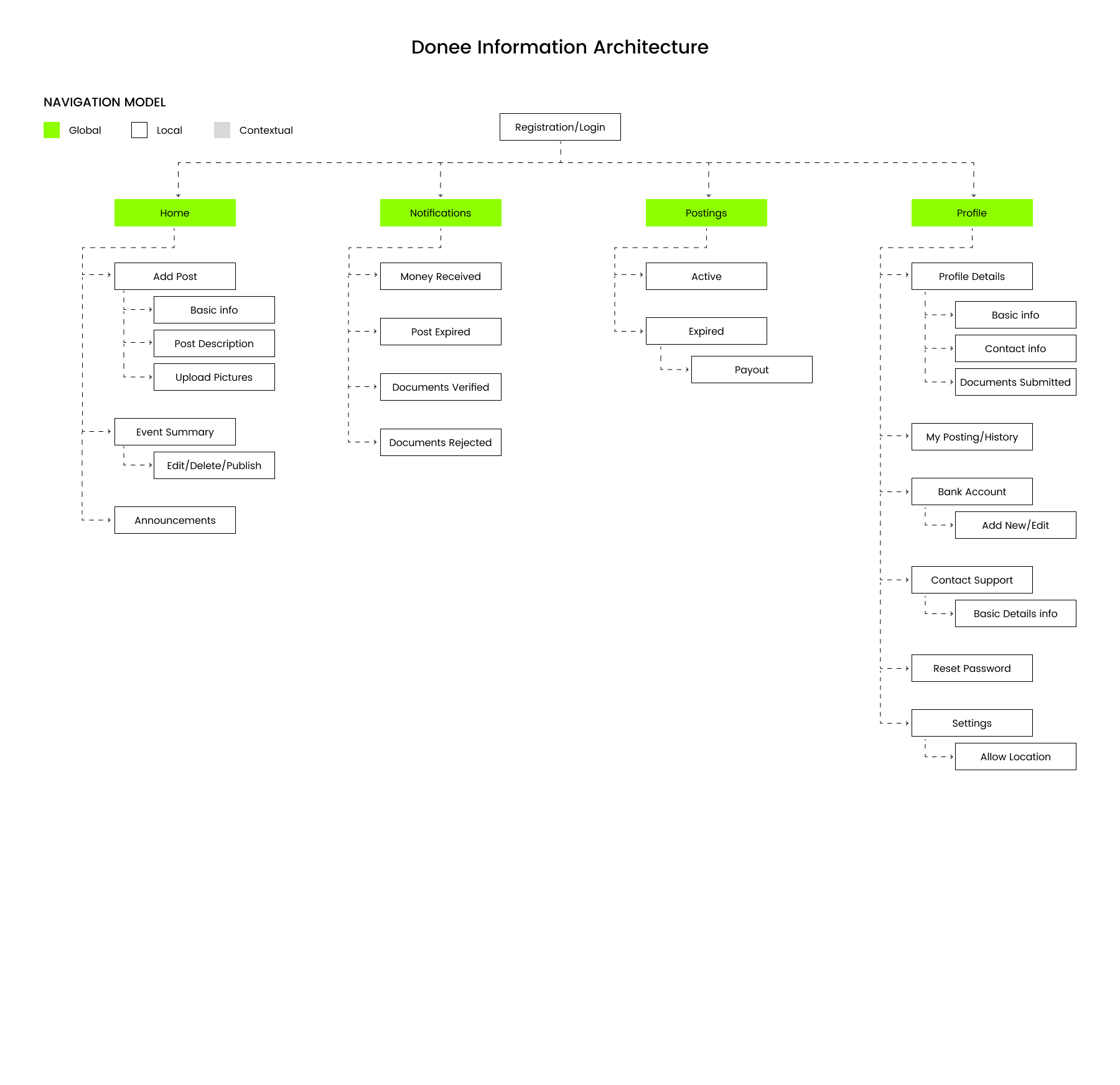
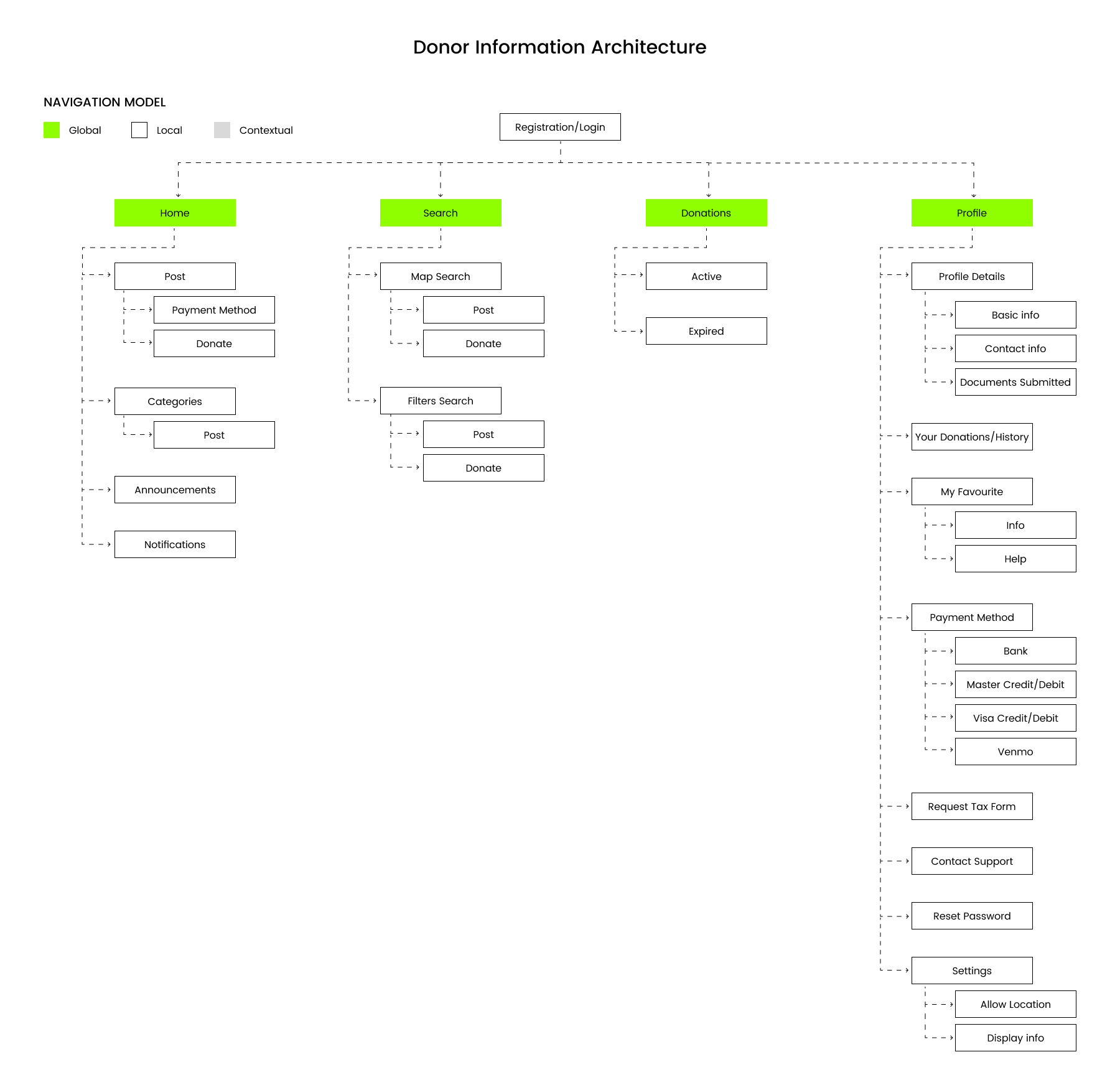
User Flow & App Structure
We constructed some rough user flow through entire application, and materialized the user flow for Donor and Donee fuctions. Simple and clear user flow chart for main functions makes easy to analyze this project’s purpose – Clean and easy to use for our main targets.
Visuals & Identity
Intuitive user interface. Simple and clean screens make usability more easier
Splash Screen
Image/animation that appears when you enter the application. It is like saying ‘welcome’ to the user. The page that will keep the user busy until the app is ready.
Verified secured
on-boarding
Starting to begin with an app. It requires your full info to proceed further. To sort of that you are real a verification process do requires it.
My Account
Check and edit your info in my account screen from name and every minor details. Your every problem solution is adroit under my account.
Posting your first ad
Begin your first ad posting with simple and smooth user experience. Fill in your title with some detail and upload your photos with amount needed. Thats it!
Help someone who
needs it
A simple and smooth donation flow allows donor to make donation nearby and into any category.
User Interface Elements & kits
On easy to use, clear and intuitive user interface. We created some constructive and Clear UI kits. There are are no an other unnecessary things, and have only essential elements to provide the best user experience.
Project Learnings
1. Communication:
Always keep all group members on the same page. Collaboration wise, I had thought that the best scenario would be every team member has their own portion of work and take responsibility for that. But when I finished the paper prototype, one of our group member got super confused on some of my design decisions, and I missed the second usability testing so it took a while to figure out where I need to make changes. If I can do the project again, I will definitely jump out of my comfort zone and get to know what others are doing, and of course, ask questions.
2. Design
Design system matters! We started working on sketch without a design system, and didn’t expect there are so many screens, and very quickly we notice some inconsistency, since when we made changes on a screen, we sometimes forgot to change other screens accordingly. After learning the concept of atomic design, we realized the importance of defining a design system before hand. In my later design work, I would leverage the existing design system like Material design or Polaris, or made one on my own.
3. Prioritization
Knowing what not to do is equally important to knowing what to do in a limited amount of time. The minimal viable product or our first baby might not be perfect in features, but we can keep iterating and plan future steps.